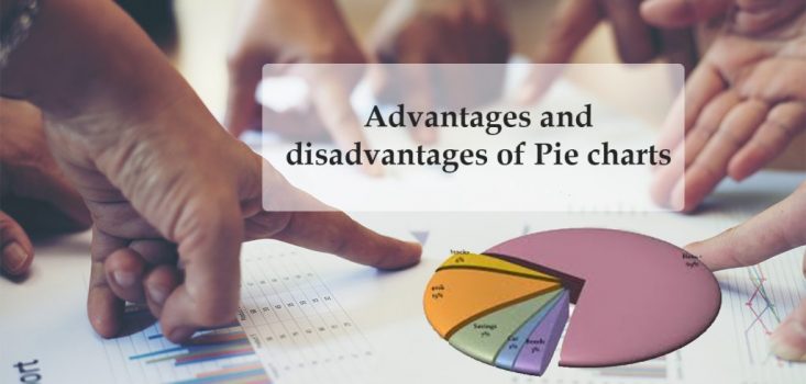
Rather than just presenting a series of numbers, a simple way to visualize statistical information for businesses is charts and graphs. The most common of these is the pie chart. As it shows data in slices, as it has a circular shape, its name comes from a resemblance of the pie. When you need to present and measure simple data, pie chart works well which is simple to create and understand. This pie chart is not suitable for the complex needs as other visualization tools like a bar graph.
Overview of Pie Charts
A pie chart is a two-dimensional circle, at its most basic, divided into a few slices. As a whole, the chart represents the sum of all its data; individual slices represents a percentage of the whole. For example, if you create a pie chart which shows product line performance, your pie chart will simply have two halves, when you have two lines that each account for 50 percent of turnover. The most prominent effects such as three-dimensional charting, dragging slices, slice pivoting of charts adds more visually appealing.
Advantages of a Pie Chart
-
A simple and easy-to-understand picture.
-
It represents data visually as a fractional part of a whole, which can be an effective communication tool for the even uninformed audience.
-
It enables the audience to see a data comparison at a glance to make an immediate analysis or to understand information quickly.
-
The need for readers to examine or measure underlying numbers themselves can be removed by using this chart.
-
To emphasize points you want to make, you can manipulate pieces of data in the pie chart.
Disadvantages of a Pie Chart
-
If too many pieces of data are used, pie chart becomes less effective.
-
They themselves may become crowded and hard to read if there are too many pieces of data, and even if you add data labels and numbers may not help here.
-
You need a series to compare multiple sets as this chart only represents one data set.
-
To analyze and assimilate information quickly, this may make it more difficult for readers
-
As the reader has to factor in angles and compare non-adjacent slices, it has its problems in comparing the data slices.
-
To make decisions based on visual impact rather than data analysis leads readers to draw inaccurate conclusions
-
Negative Pie / positive Pie cannot be understood until I hover the pointer on the pie. So when Negative data present, pie chart is a bad option
Alternatives to a Pie Chart
-
If you are handling many pieces of data or want to make comparisons between data sets, other charts and graphs may be a better option
-
To add the ability to display multiple datasets, doughnut charts share the circular shape and overall functionality of pie charts.
-
To make it easier to compare segments, you can place data labels and totals in the doughnut hole
-
To allow quick comparison and measurement, bar graphs can be represented data by length.
-
Presenting many pieces of data at a time or want to compare different sets of data in a single chart may be easier to read
-
Also, Treemap can be used as a way to display categorical values as a percentage of the total.


